Barfoot & Thompson Pukekohe - Commercial Fitout, 2025
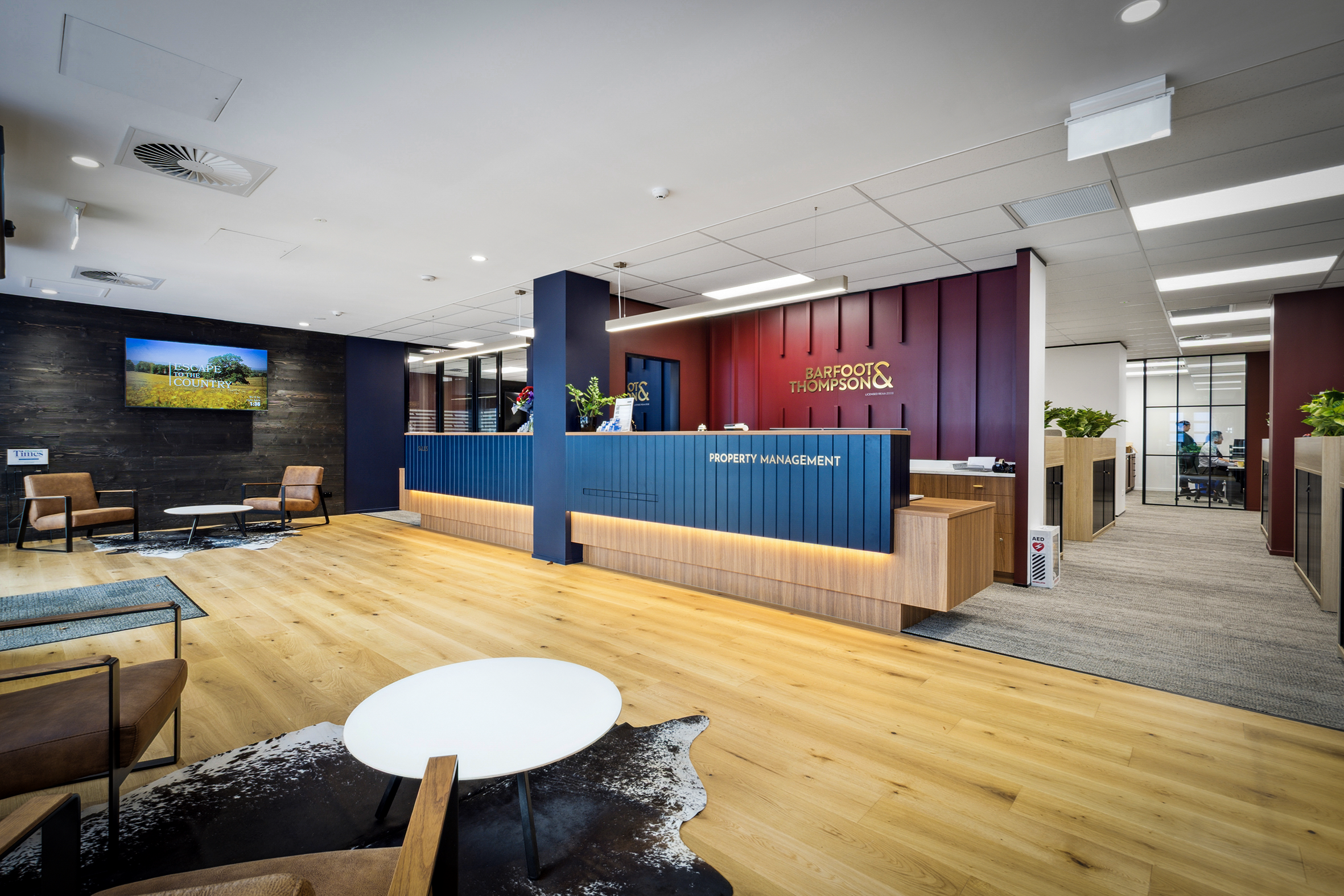
Every good design has a reason behind every decision. For the Barfoot & Thompson Pukekohe office, the brief asked for a country feel - and rather than reaching for the predictable, the response was to reinterpret that as lodge: warm, grounded and quietly sophisticated.
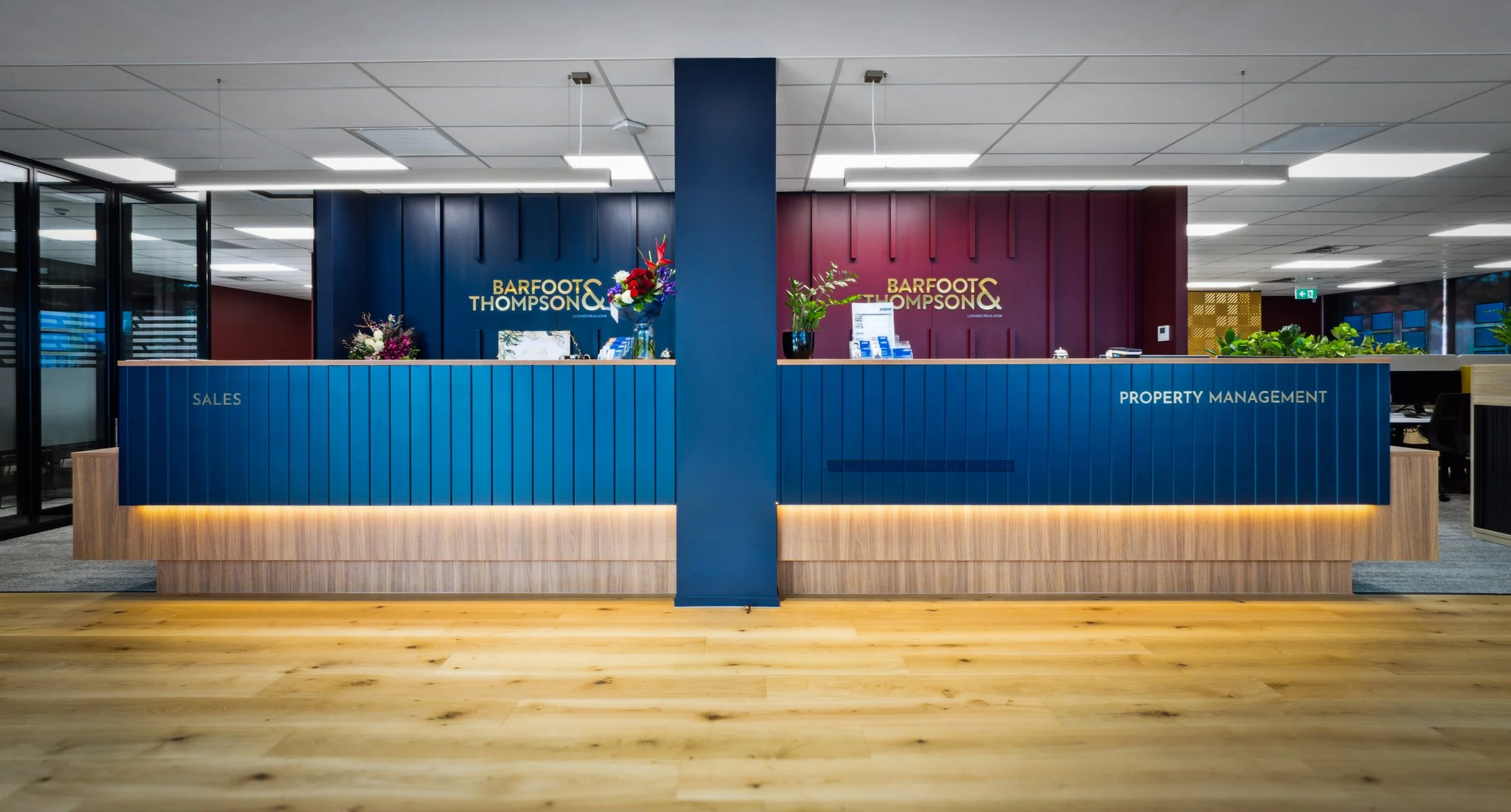
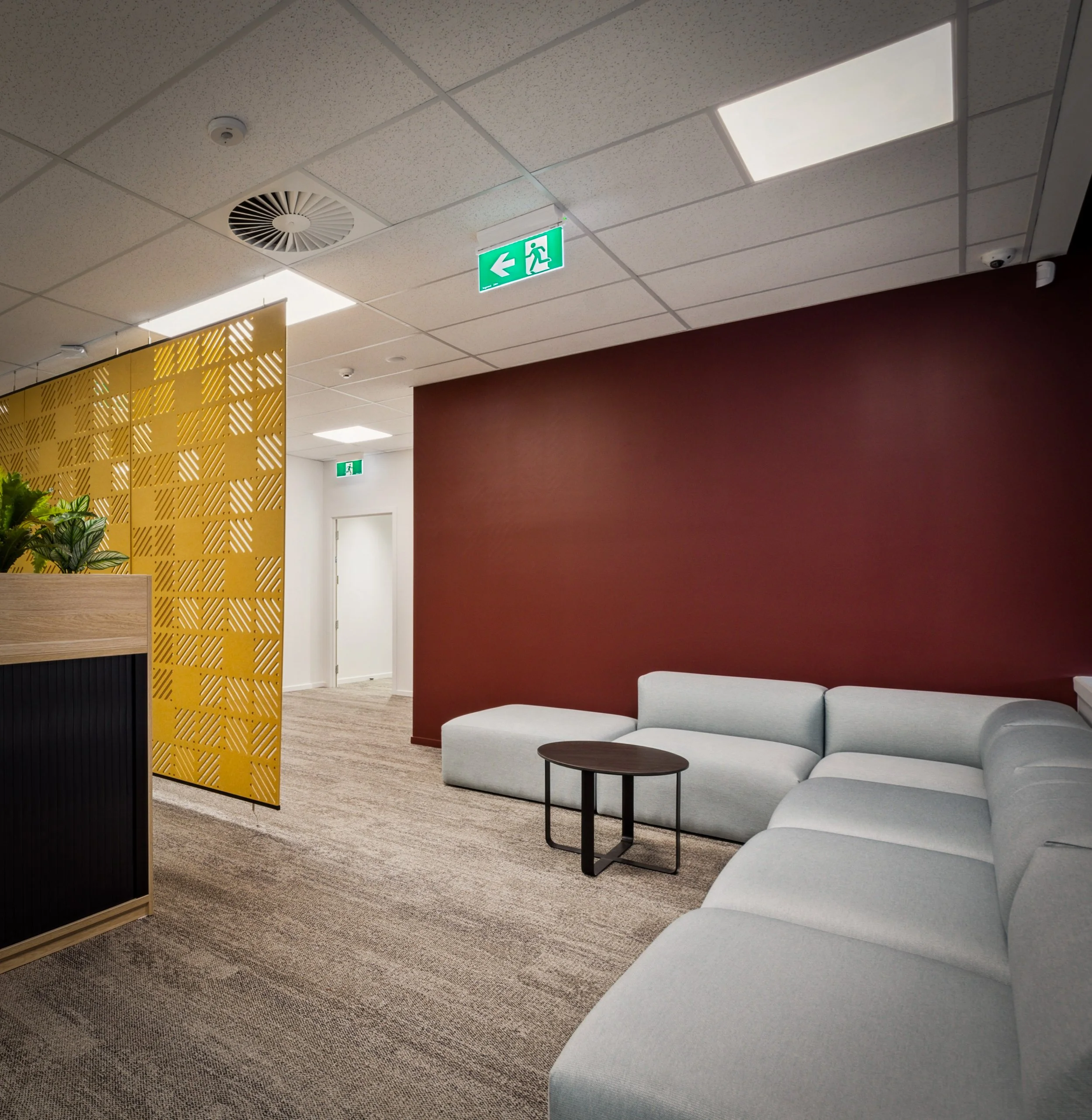
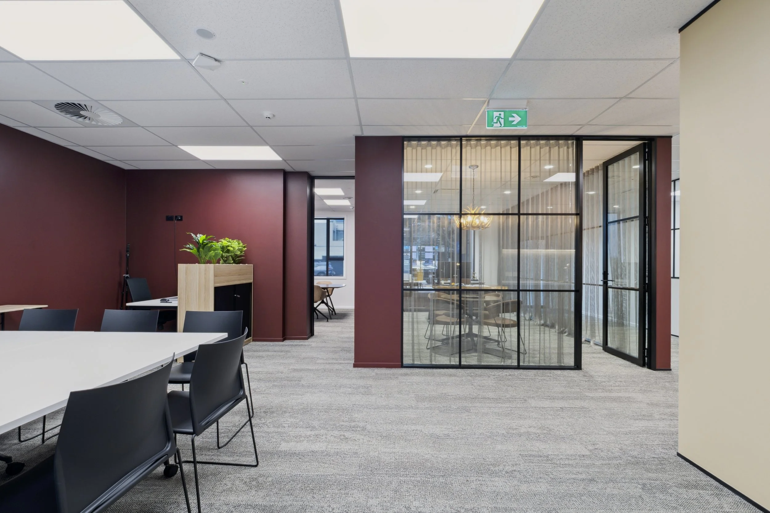
The colour palette tells the local story. Pukekohe's distinctive burnt red volcanic soil inspired the deep burgundy that anchors the reception and open plan areas, while gold - drawn directly from the Barfoot & Thompson logo - appears in the perforated screen panel in the waiting lounge, connecting brand identity to interior detail. Timber joinery and the panelled wall behind reception reinforce the lodge reference throughout.
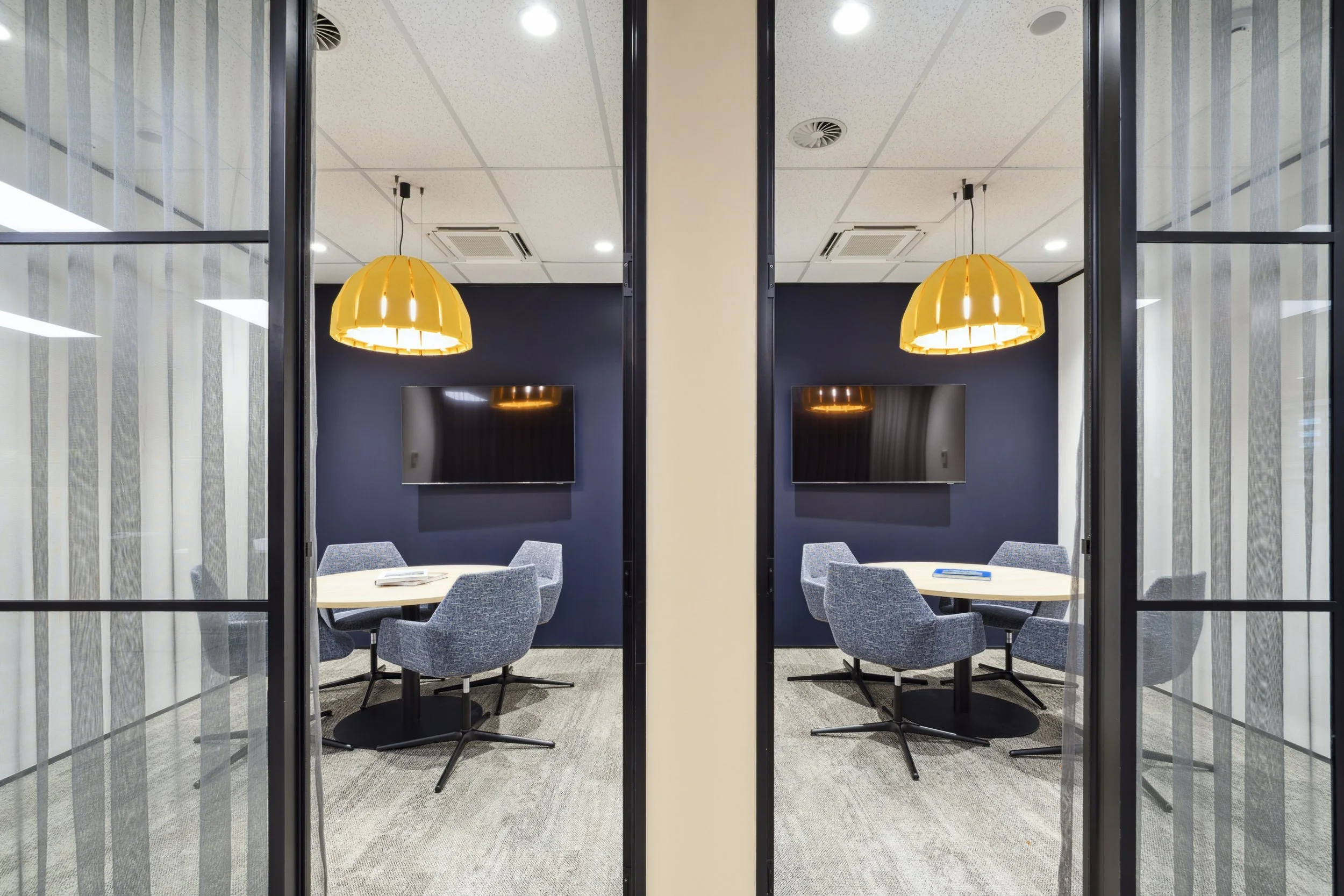
Blue ribbed reception desks carry the corporate palette through cleanly, while black steel and glass partitions define the meeting rooms without closing the space down. Acoustic pendants add warmth to the meeting spaces, softening what could otherwise feel like a purely corporate environment.
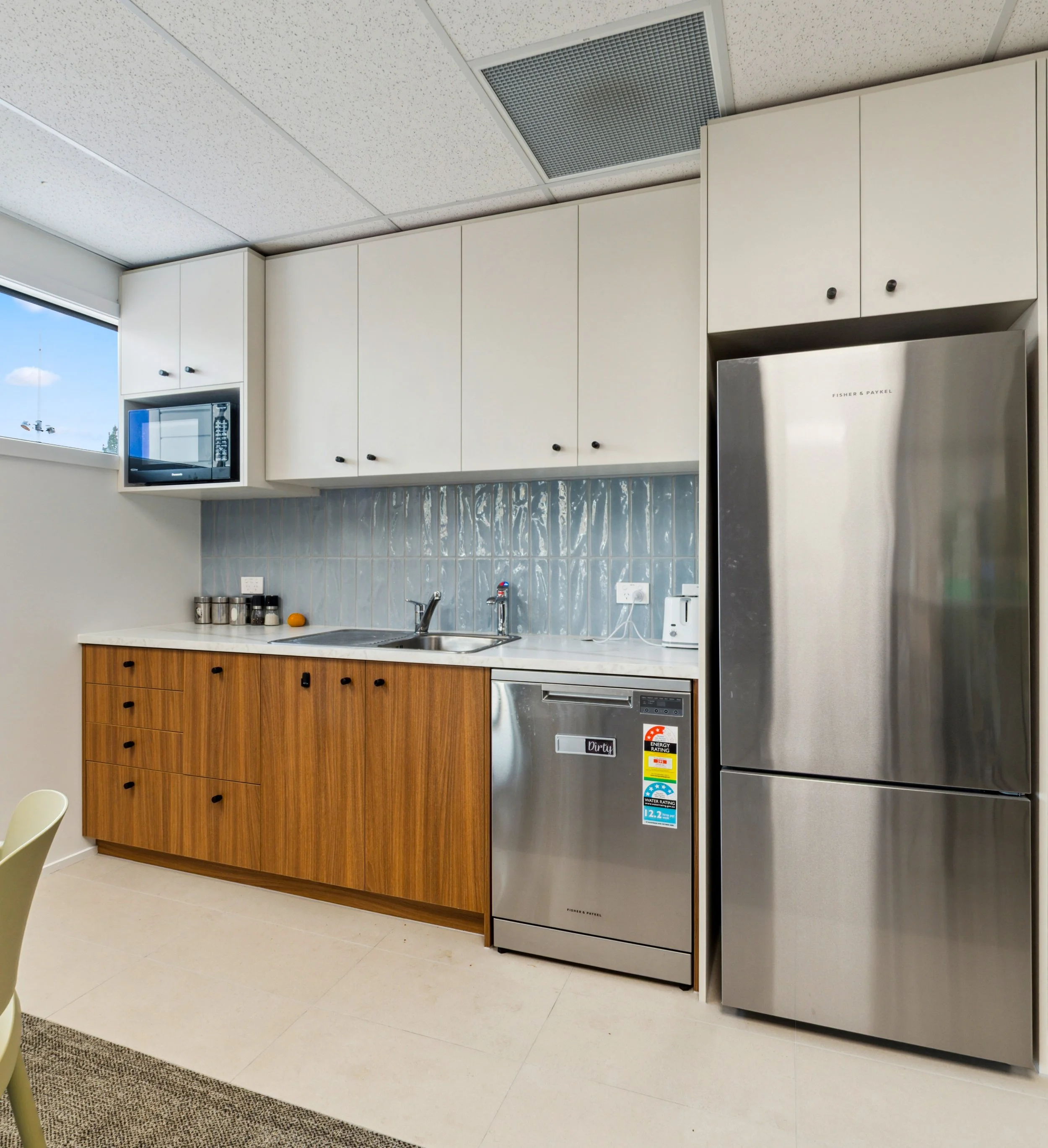
The design scope covered the reception, wall and furnishing colour selections, and the staff kitchen - the spaces that shape how both clients and staff experience the office every day.
Designed by Everyday Joy in collaboration with the principal contractor.